At one level, the global Great Recession has been about the bursting of a tremendous housing bubble that saw a doubling in house prices in only 5 years, and close to 3 million houses being built in 2005 as the market peaked.
Last year, as part of the economic stimulus package, Congress passed an $8000 housing tax credit which had stabilized sales and slowed price declines. With the expiration of that credit, there has been a sudden decline in purchase mortgage applications, housing permits and starts. Prices look primed to resume a sharp decline, and there is talk of a double-dip recession as a result.
So, this seems an appropriate time to step back and take an updated "big picture" look at the state of the housing bust. As we will see, the big surprise is that, compared with historical prices, 4 years into the bust, Housing is STILL too expensive.
1. Introduction
Way back in the blog-Age of Dinosaurs -- 2006 -- several of my earliest posts called the turn of the housing market in real time. They were heavy tomes full of numbers, and landed here with such a heavy thud that they could probably plug up the BP gusher in the Gulf of Mexico. But they were right, and they landed me plaudits from a number of real estate cogniscenti who used to post here. In doing so, I made use of price data from dozens of cities kept at Housing Tracker. As we will see below, the most critical piece of information is still found at same web site.
2. Housing always leads
Three years ago I described the very significant research paper entitled "Housing and the Business Cycle" (pdf) presented by Prof. Edward Leamer of UCLA at the Federal Reserve's annual summer retreat in Jackson Hole. What follows is a copy of the salient points I made in that post.
Prof. Leamer demonstrated that almost every recession since the end of World War II was preceded by a slowdown in housing construction and secondarily in major consumer purchases like cars. According to Leamer, of the 10 recessions that have occurred since World War II:
We have experienced 8 recessions preceded by substantial problems in housing and consumer durables.... .... Residential investment consistently and substantially contribute[d] to weakness [in GDP growth] before [ these 8 ] recessions.... .... After residential investment as a contributor to prior weakness come consumer durables, consumer services, and then consumer nondurables. Those are all consumer spending items -- it's weakness in consumer spending that is a symptom of an oncoming recession.... The timing is: homes, durables, nondurables, and services. Housing is the biggest problem in the year before a recession... durables is the biggest problem during the recession [although consumer durables declined even more than housing before 2 of the 10 post World War II recessions]
In terms of timing, housing typically begins to decline 5 quarters before recession, with durables and nondurables hitting their peak 4 quarters before the recession, and gently declining until the recession hits. The only two times since World War II that a substantial housing decline did not presage a recession were in the midst of the Korean War and the Vietnam War.
After a housing slump, the next part of the economy to turn negative before a recession is consumer durables, meaning big-ticket items that consumers purchase to last a long time. The biggest example of that is cars. As Leamer explained:
The same interest rate or other variables [mainly employment] drive both the housing cycle and the durables cycle.... It turns out that much of the ampitude inconsumer durables comes from vehicles not furniture
and he explained why this is so:
Both durable manufacturing and residential construction have four special features:
Previous production of new homes and cars create a stock of existing assets that compete with current production.... The asset prices of both homes and new cars suffer from downward price rigidities
In other words, the economy can only sustain X amount of cars and houses in any given period. Overbuilding in one period (a boom) means that in the next period, there will be underproduction (a bust). It is this absollute decline in activity that forms the basis for the recession.
Leamer also pointed out that it appeared that the pattern also fit with the Great Depression. Subsequently I was able to track down the annual statistics kept by the Census Bureau at that time, and in Housing During the Roaring Twenties and Great Depression, confirmed that annual new housing sales did peak in 1925 (at a population-adjusted number very close to the top number in 2005) before declining to a bottom in 1933. No doubt to his everlasting chagrin, Leamer instead predicted in 2007 that the accelarting downturn in housing would be an exception, and would not result in a recession. We know how that turned out!
Nevertheless, just as predicted by Leamer's model, housing permits, starts, and sales did continue to slide into the recession, and auto sales began their decline shortly before the onset of the recession as well. Subsequently both bottom before the end of the Great Recession, and increased thereafter -- albeit at a lackluster pace:
Image may be NSFW.
Clik here to view.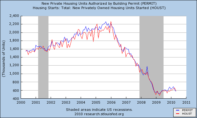
Similarly auto sales bottomed in the first half of 2009, and also increased since then:
Image may be NSFW.
Clik here to view.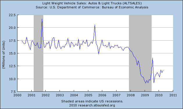
To cut to the chase, the Great Recession supports the thesis set forth in Leamer's model: Housing is a "long" leading indicator for the economy in general, and jobs and unemployment in particular (as opposed to "short" leading indicators like real M1 and the stock market).
For example, here is a graph of the year-over-year increase or decrease in housing starts vs. year over year percent increase or decrease in jobs over the last 50 years. Notice that the peaks and troughs for housing construction (blue) generally occur well in advance of the growth and decline in jobs (red):
Image may be NSFW.
Clik here to view.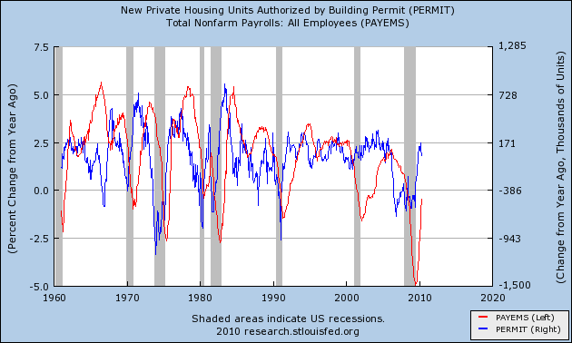
The same can be seen in the following graph of the number of housing starts (blue) and the unemployment rate (inverted, so lower values mean a higher percent of unemployed)(red):
Image may be NSFW.
Clik here to view.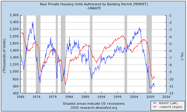
3. New and Existing Home Sales
In the last few months, there has been another deflationary pulse, driven by steep declines in commodity prices, especially gasoline, and by the very slow decline in "owner's equivalent rent" (which is the controversial way in which the BLS measures housing prices). Coincidentally, because of the expiration of the $8000 housing credit, housing permits and starts, and home sales, have fallen again. Although we cannot say for sure that May marked the end of this renewed decline, at 574,000 units, it does appear that new home sales will not fall all the way back to the early 2009 bottom if 522,000 housing permits. But a large and sustained decline is nevertheless a cause for concern.
Whether this just means a "soft patch" of slower growth in the next few months, or whether there is an actual (probably brief and shallow) decline of GDP growth, the fact is that the housing component of the recent improvements to the economy have been very weak, correlating with a persistently high unemployment rate and a less strong recovery in jobs (600,000 non-census jobs added since the bottom last December) than we could otherwise expect.
The bottom line is, for there to be a sustained and strong Recovery, we would need sustained and strong growth in housing construction. BUT, there will not be a sustained and strong rebound in housing construction so long as there are many 100,000s of houses for sale or in foreclosure, hanging over the market. One benchmark is that this overhang will not revert to norm until there is no more than 6 months of inventory on the market. As of the last few month, there was more than 8, as depicted in this graph:
Image may be NSFW.
Clik here to view.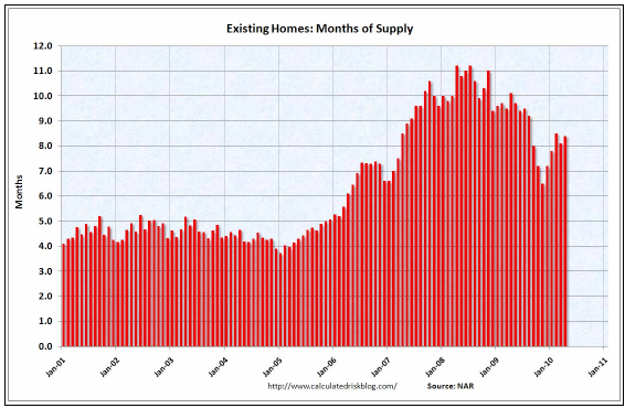
(h/t Calculated Risk). So long as this overhang persists, it is going to suppress residential construction, and so jobs and the economy. So the question becomes, when do housing prices become low enough so that demand increases to the point where the overhang of vacant or foreclosed houses dissipates?
4. House Prices
Here is where the continuing data from Housing Tracker, the web site that was so instrumental 4 and 5 years ago in showing the turn of the housing market, is so essential. The following graph, from that site, shows the relationship between median household income and housing prices, normed to 100 in the year 2000. The three lines make use of the Case-Schiller, FHFA, and First American Indexes:
Image may be NSFW.
Clik here to view.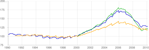
The simple fact is, even after 4 years of a bursting bubble, housing prices are still expensive, compared with their long-term norm. As you can see from the above graph, by no measurehave house prices returned to their long term norm. They are still about 20%-25% higher in real terms compared with the income of the people who must after all buy them, than they were 10 years ago. And there is no guarantee they won't overshoot the mark. Notice also that they generally went sideways in 2009 as people took advantage of the $8000 home buying tax credit. With that credit gone, the slide in house prices is resuming. If prices decline at the same rate, compared with median income, as they did between 2006-2008, it will probably take at least 2 more years for prices to revert to their long term norm, and approach a bottom.
Variances is metropolitan areas help show us the relationship between prices and clearing out the overhang of houses on the market from the bubble. On the one hand, prices in Seattle, Washington peaked late -- about 2007, and have not declined nearly as much as the norm, in terms of income, as the national average:</div><div>
Image may be NSFW.
Clik here to view.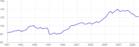
As a result, the number of houses for sale in the area has continued to increase up to the present. There is still a huge overhand, and so we can expect a lot of further declines in home prices in Seattle:
Image may be NSFW.
Clik here to view.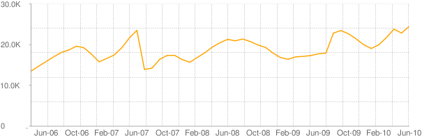
On the other hand, prices in Phoenix, Arizona, one of the epicenteres of the housing bubble, peaked early, and prices as a multiple of median income have declined almost all the the way to their prior norm in 2000:
Image may be NSFW.
Clik here to view.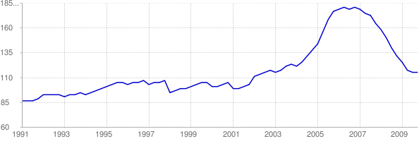
As a result, the number of houses for sale has declined dramatically, and prices may stabilize very soon if they aren't doing so already:
Image may be NSFW.
Clik here to view.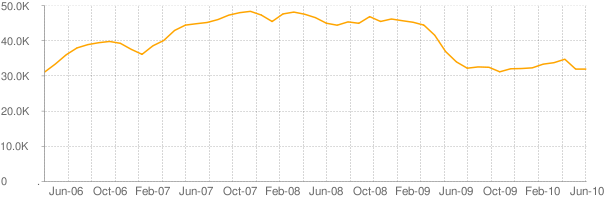
Eventually, however, housing will return to its long term norm. Here is a graph I ran a few months ago, showing housing starts as a fraction of population:
Image may be NSFW.
Clik here to view.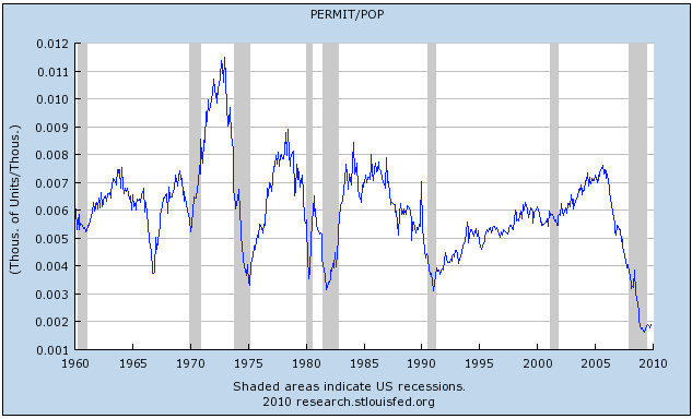 On a per capita basis, the housing boom of a few years ago doesn't look that outlandish at all! In fact, at least 3 prior booms in the last 40 years were bigger. On the negative side, the current housing bust is even more clearly the worst in the post WW2 era. For the last couple of years, housing starts have come nowhere near where they need to be to keep even with population growth. At some point, prices will fall enough and there will be enough pent-up demand, that the housing bust will end.
In Conclusion
When will that happen? House Prices must - and will - fall at least another 15%-20% to revert to their long term norm as a multiple of income. As that happens, more existing homes will be bought, and the sooner the backlog of unsold homes will be absorbed. Then and only then can we expect a substantial and sustained improvement in housing construction, and thereby a substantial and sustained improvement in the economy.
Based on the above, that date appears to be at least 2 years away.